
Ikko Tanaka - Shaping MUJI’s Iconic Serene Design

Ikko Tanaka poster for Muji - 1981
The global Japanese retail company MUJI is known for its straightforward approach, embracing the elegance of functionality and the absence of branded products. In pursuit of this philosophy, a distinct aesthetic vision was needed. That’s where Ikko Tanaka entered the room.
Designing a vision
In 1980, MUJI was announced in major Japanese newspapers via a simple yet effective monochrome ad. Back then, MUJI was introduced as a product brand for the supermarket chain “The Seiyu”, which in turn was owned by “Seibu Holdings”, of which Ikko Tanaka was the creative director since 1975.
Ikko Tanaka was renowned for his use of natural motifs and forms, placing them against monochromatic backdrops. His style is often referred to as an iteration of Rinpa, a Japanese art style focused on abstracted natural motifs. This resulted in Tanaka positioning himself as a designer that was best at incorporating (or preserving) traditional Japanese aesthetics in modern design.
For MUJI’s announcement visual in 1980, the first ever visual to be created for the brand, Tanaka focused on two main elements. The first being a minimalistic, cartoon-like hand holding an "answer card" with MUJI’s full name, "Mujirushi Ryouhin”, written on it. These answer cards were pretty iconic at the time, being used in TV shows to indicate a correct answer. Therefore the visual connected with a wide TV-watching audience, from grandmothers to children, suggesting that MUJI was the ideal choice. Secondly, the inclusion of the catchphrase "わけあって、やすい。" written by Kazuko Koike, which can be translated as "low price for a reason."
Both elements were placed on a kraft paper background in MUJI’s brand colors. It illustrates the power of simplicity in Tanaka’s work, and his ability to introduce elements of traditional Japanese art with the principles of modern design at the time.
This serene and minimalistic approach shaped MUJI’s design policy, which is in place to this day. It laid the stylistic groundwork for Ikko Tanaka's creative contributions to the brand over the next two decades. Often in collaboration with the late illustrators Yuzo Yamashita and Makoto Wada, he created a variety of posters which embrace MUJI’s philosophy of simplicity as a hallmark of quality. We selected some of our favorite work from Tanaka for Muji below.
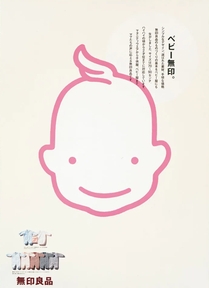

The poster design from 1999 with the headline “Baby unlabeled / unbranded”. The limited text emphasizes the importance of the chosen materials for the baby clothing, in combination with a simple design, and affordable pricing.

Ikko Tanaka’s poster for natural materials - 1997
In this 1997 poster design above, the headline "aptitude" is positioned in the top right corner, alongside the bottom left note highlighting how MUJI products exemplify the essence of material quality in its purest form.

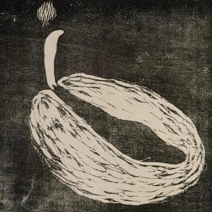
Ikko Tanaka’s poster for less fish waste - 1981
This poster design from 1981 with the headline “the entire fish is salmon”, challenged the notion that only the middle part of salmon is used for consumption. It playfully highlights how the parts closer to the tail or head end up in the bin while being just as delicious.

Ikko Tanaka’s poster for unprocessed food - 1998
This poster design from 1998 with the headline “its food is fresh / unprocessed”. The poster’s sidenote emphasizes MUJI's unwavering commitment to raw ingredients and their nutritional value. It highlights how MUJI places great importance on selecting fresh, unprocessed ingredients, ensuring that their food offerings maintain their natural freshness.
The visual direction of Ikko Tanaka impeccably reinforced MUJI's philosophy. By embracing simplicity, the majority of Tanaka’s work revolves around a single picture or illustration that, complemented by a clever headline, effectively conveys MUJI's unwavering commitment to prioritizing quality. Tanaka's approach captured the essence of MUJI's vision, skillfully merging aesthetics with the brand's core principles.

Ikko Tanaka & Makoto Wada poster for Muji - 1983
Trending Articles

Explore Ochiai's unique style blending nostalgia, chaos, and punk spirit.